Interactive Tutorials
A tour points at things. A tutorial makes the user do them: type in the field, tap the button, draw on the canvas, with the rest of the screen out of reach until the step is done. This guide shows the pieces Waypoint gives you for that, then puts them together.
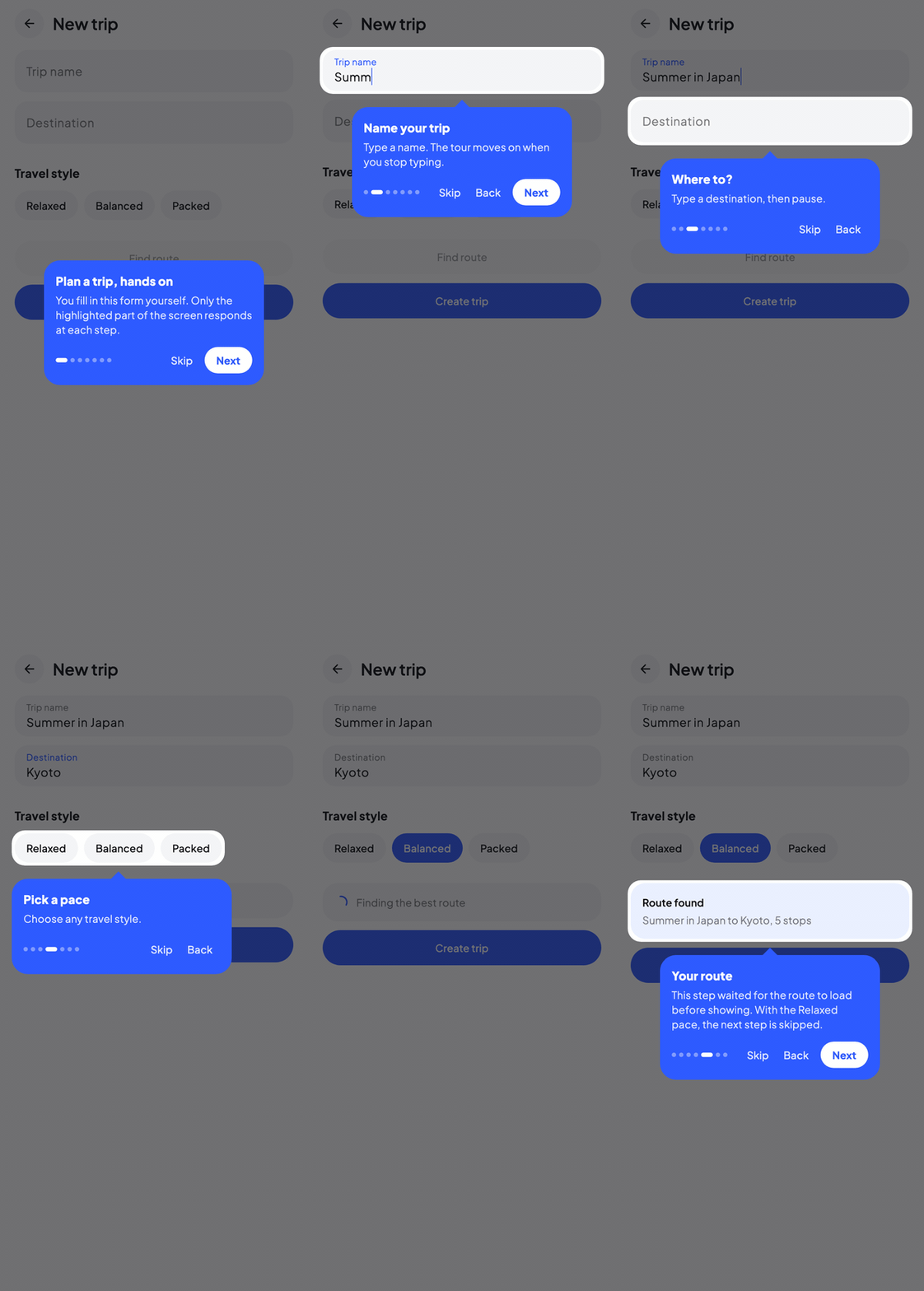
In the recording the user fills in a form step by step. Each field is open to input while it is highlighted, and the tour moves on by itself once the field has a value.
Let the user work inside the target
TargetInteraction.PassThrough opens the highlighted area to real input. Every gesture inside it (taps, drags, text selection, typing) reaches your app, and everything outside stays blocked.
step(NoteTarget.Title) {
    title = "Give it a title"
    description = "Type at least 3 characters."
    interaction = TargetInteraction.PassThrough
}
A tap outside the highlighted area follows the host's overlayClickBehavior (nothing by default).
Note
Blocking is the host's blockOutside (on by default) and works with every highlight style. With blockOutside = false nothing is blocked and interaction has no effect. See Touch blocking.
Advance when the user has done it
advanceOn takes a suspend block. It starts once the step is on screen, and the tour moves on when it returns. Most of the time it waits for a piece of state:
step(NoteTarget.Title) {
    title = "Give it a title"
    description = "Type at least 3 characters."
    interaction = TargetInteraction.PassThrough
    advanceOn { snapshotFlow { noteTitle }.first { it.length >= 3 } }
}
The block is cancelled if the user leaves the step some other way, so it needs no cleanup. See Event-Driven Progression for callback and flow based variants.
Open a larger area than the anchor
The tooltip is anchored on the step's own target, but PassThrough applies to every highlighted area. List the rest of the working area in additionalTargets to point the tooltip at a small control while a larger region stays usable:
step(NoteTarget.Bold) {
    title = "Make it stand out"
    description = "Write something below, then tap B."
    interaction = TargetInteraction.PassThrough
    additionalTargets = listOf(NoteTarget.Body)
    advanceOn { snapshotFlow { isBold }.first { it } }
}
Here the tooltip and its arrow point at the B button, and both the button and the note body accept input.
Two things to know:
- The interactive areas are rectangles, not the exact cutout shape: the corners around a rounded or circular cutout still accept touches.
- Additional targets must live in the same host as the step's target.
Intro and outro cards
step { } without a key declares a step with no target. Its tooltip is shown centered over the host, which is what you want for a welcome card and a closing card:
step {
    title = "Write your first note"
    description = "A hands-on tour of the editor. It takes a minute."
}
With a Spotlight highlight the scrim covers the whole host with no cutout, so the screen is blocked while the card is up. StepScope.placement is null for these steps and no arrow is drawn. interaction and additionalTargets are ignored, everything else (showIf, beforeShow, advanceOn, onEnter, onExit) works as usual.
When a tour spans several hosts, steps without a target are always shown by the primary WaypointHost.
Wait before showing a step
A step is not shown until its beforeShow block returns. Use it to let the UI settle after the previous action, or to wait for something specific:
step(NoteTarget.Save) {
    // Let the keyboard close and the layout settle.
    beforeShow { delay(300) }
}

step(NoteTarget.Body) {
    // Wait until the panel that holds the target is open.
    beforeShow { snapshotFlow { isPanelOpen }.first { it } }
}
While the block runs nothing is highlighted and, by default, nothing is blocked. See Async Gates for the details.
Keep the screen covered between steps
Between two steps the scrim can be gone for a moment: the beforeShow gate is running, or the next target is not laid out yet. The simplest fix is to let the spotlight stay up:
WaypointHost(
    state = state,
    highlightStyle = HighlightStyle.Spotlight(coverWhilePending = true),
    ...
)
While a step is pending the host then draws the scrim with no cutout and blocks all input. Escape and the overlay click behavior still work, and a target the user scrolls away during a PassThrough step does not count as pending. See Highlight Styles.
Block your own UI while a step is pending
The alternative is to leave the screen uncovered and disable your own controls. WaypointState.isStepVisible tells you whether the current step is actually on screen:
// True while a step is pending: its beforeShow gate is still running.
val isBusy = state.isActive && !state.isStepVisible

TextField(
    value = noteTitle,
    onValueChange = { noteTitle = it },
    enabled = !isBusy,
    modifier = Modifier.waypointTarget(state, NoteTarget.Title),
)
isStepVisible is backed by snapshot state, so it works in composition and in snapshotFlow. It is also false while the tour is paused.
Block without dimming
Dimming the screen can get in the way when the user needs to see what they are working on. Blocking does not depend on the dimming, so pick any undimmed style and keep the host's default blockOutside = true:
WaypointHost(
    state = state,
    highlightStyle = HighlightStyle.None,
    tooltipContent = { scope -> TutorialTooltip(scope) },
) {
    NoteEditor()
}
HighlightStyle.None blocks everything outside the target's own bounds; HighlightStyle.Border or Pulse add a visible frame and use its padded shape as the interactive area; HighlightStyle.Spotlight(overlayAlpha = 0f) keeps the spotlight's shape and padding with an invisible scrim. All of them can be set per step with highlightStyle = ..., and a step that should not block at all sets blockOutside = false.
With nothing dimmed the target no longer stands out. A custom spotlight effect can outline it instead:
highlightStyle = HighlightStyle.Spotlight(
    overlayAlpha = 0f,
    effect = SpotlightEffect.Custom { bounds ->
        drawRoundRect(
            color = Color(0xFF7C4DFF),
            topLeft = bounds.topLeft,
            size = bounds.size,
            cornerRadius = CornerRadius(8.dp.toPx()),
            style = Stroke(width = 2.dp.toPx()),
        )
    },
)
A tooltip without a Next button
The Material3 tooltip hides its Next button while a step advances automatically (StepScope.advancesAutomatically), so with advanceOn on every hands-on step the user has to perform the action. When the user goes back into such a step with Back, the trigger is not re-armed and the Next button comes back, see Event-Driven Progression. For a tutorial a custom tooltip is often still a better fit. Everything it needs is on the StepScope, and TooltipArrowBox draws the arrow:
private val TooltipColor = Color(0xFF1B1B2F)

@Composable
fun TutorialTooltip(scope: StepScope) {
    TooltipArrowBox(arrowColor = TooltipColor) {
        Column(
            modifier = Modifier
                .widthIn(max = 280.dp)
                .clip(RoundedCornerShape(16.dp))
                .background(TooltipColor)
                .padding(16.dp),
            verticalArrangement = Arrangement.spacedBy(8.dp),
        ) {
            scope.title?.let { Text(it, color = Color.White, fontWeight = FontWeight.SemiBold) }
            scope.description?.let { Text(it, color = Color.White.copy(alpha = 0.8f)) }
            if (scope.placement == null) {
                // Intro and outro cards have no target, so they need a button.
                Button(onClick = { scope.next() }) {
                    Text(if (scope.isLastStep) "Done" else "Start")
                }
            } else {
                TextButton(onClick = { scope.skip() }) { Text("Skip tutorial") }
            }
        }
    }
}
TooltipArrowBox renders the bare content for steps without a target, so the same composable works for the intro and outro cards. See Custom Tooltips for more.
Keyboard
During a PassThrough step the host stays out of the way: it does not take keyboard focus and only handles the dismiss keys (Escape by default), so arrows and Enter go to the field the user is typing in.
On every other step the default keys apply, which means Enter or the right arrow moves to the next step. In a tutorial that is rarely what you want, because it lets the user skip ahead from the keyboard. Keep Escape and drop the rest:
Or turn keyboard handling off entirely with KeyboardConfig.Disabled. See Keyboard Navigation.
Putting it together
enum class NoteTarget { Title, Bold, Body, Save }

@Composable
fun NoteTutorial() {
    var noteTitle by remember { mutableStateOf("") }
    var noteBody by remember { mutableStateOf("") }
    var isBold by remember { mutableStateOf(false) }
    var isSaved by remember { mutableStateOf(false) }

    val state = rememberWaypointState {
        step {
            title = "Write your first note"
            description = "A hands-on tour of the editor. It takes a minute."
        }
        step(NoteTarget.Title) {
            title = "Give it a title"
            description = "Type at least 3 characters."
            interaction = TargetInteraction.PassThrough
            advanceOn { snapshotFlow { noteTitle }.first { it.length >= 3 } }
        }
        step(NoteTarget.Bold) {
            title = "Make it stand out"
            description = "Write something below, then tap B."
            interaction = TargetInteraction.PassThrough
            additionalTargets = listOf(NoteTarget.Body)
            advanceOn { snapshotFlow { isBold }.first { it } }
        }
        step(NoteTarget.Save) {
            title = "Save your work"
            interaction = TargetInteraction.PassThrough
            advanceOn { snapshotFlow { isSaved }.first { it } }
        }
        step {
            title = "You're all set"
            description = "That is everything you need to take notes."
            beforeShow { delay(300) }
        }
    }

    // True while a step is pending: its beforeShow gate is still running.
    val isBusy = state.isActive && !state.isStepVisible

    LaunchedEffect(Unit) { state.start() }

    WaypointHost(
        state = state,
        keyboardConfig = KeyboardConfig(nextKeys = emptySet(), previousKeys = emptySet()),
        tooltipContent = { scope -> TutorialTooltip(scope) },
    ) {
        Column(modifier = Modifier.fillMaxSize().padding(16.dp)) {
            TextField(
                value = noteTitle,
                onValueChange = { noteTitle = it },
                enabled = !isBusy,
                modifier = Modifier.waypointTarget(state, NoteTarget.Title),
            )
            TextButton(
                onClick = { isBold = !isBold },
                enabled = !isBusy,
                modifier = Modifier.waypointTarget(state, NoteTarget.Bold),
            ) { Text("B") }
            TextField(
                value = noteBody,
                onValueChange = { noteBody = it },
                enabled = !isBusy,
                textStyle = LocalTextStyle.current.copy(
                    fontWeight = if (isBold) FontWeight.Bold else FontWeight.Normal,
                ),
                modifier = Modifier.waypointTarget(state, NoteTarget.Body),
            )
            Button(
                onClick = { isSaved = true },
                enabled = !isBusy,
                modifier = Modifier.waypointTarget(state, NoteTarget.Save),
            ) { Text("Save") }
        }
    }
}
Warning
Inside a step { } block, title and description are the step's own properties. A local variable with the same name declared outside the block takes precedence, so title = "..." would assign your variable instead of the step's title. That is why the state above is called noteTitle.
The sample app's Interactive tutorial demo is a complete version of this pattern, including a conditional step.
See also
- Event-Driven Progression, more ways to write
advanceOn. - Async Gates,
beforeShowin depth. - Custom Tooltips,
StepScopeand arrows. - Keyboard Navigation, key bindings and focus.