Highlight Styles
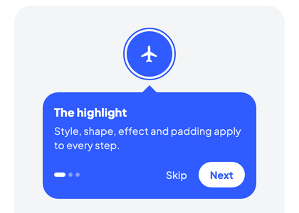
A highlight style controls how the area around a tour target is visually emphasized. Waypoint ships with five built-in styles plus a fully custom escape hatch.
| Spotlight | Pulse | Border | Ripple |
|---|---|---|---|
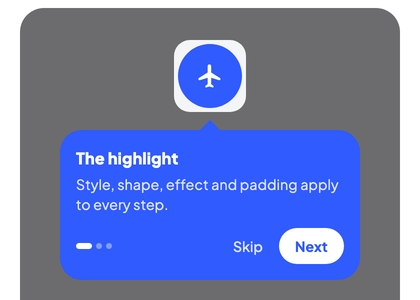 | 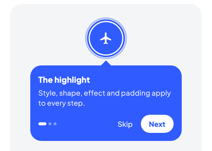 |  | 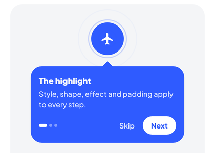 |
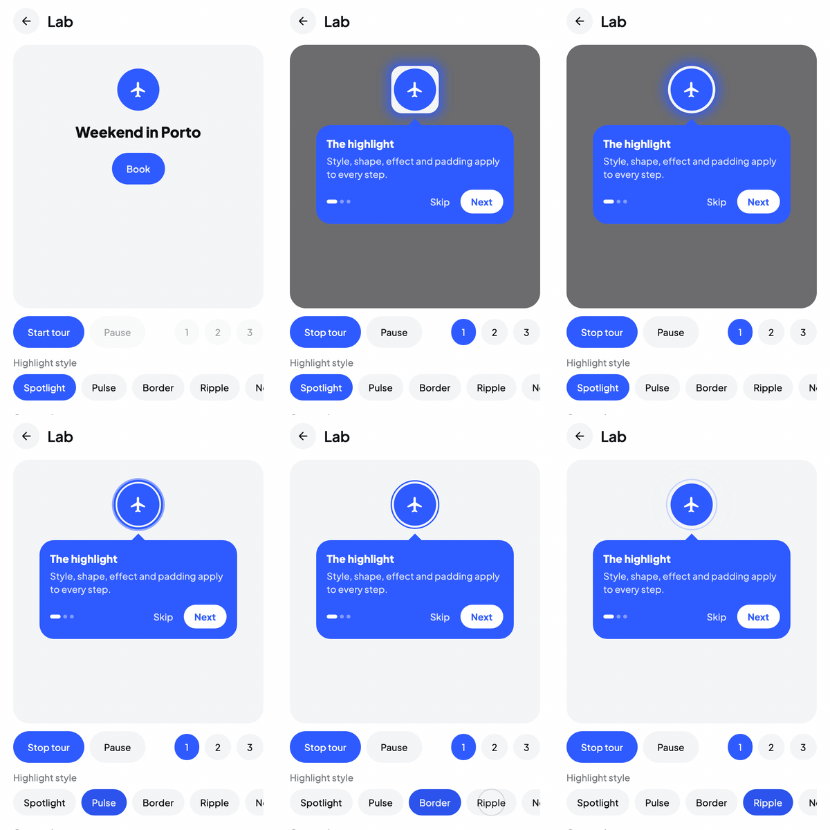
Pulse and Ripple are animated. The sample app's Lab screen switches between all of them on a running tour:
Where it's applied
Highlight styles can be set at two levels:
- Host-wide via
WaypointHost(highlightStyle = ...)orWaypointMaterial3Host(highlightStyle = ...). Every step inherits this style unless it overrides it. - Per-step via
highlightStyle = ...inside astep { }block. When a step sets its own style, it takes precedence over the host-level one.
val state = rememberWaypointState {
    step(Targets.SearchBar) {
        title = "Search"
        // Inherits host highlightStyle
    }
    step(Targets.AddButton) {
        title = "Create"
        // Overrides the host default
        highlightStyle = HighlightStyle.Pulse(
            color = Color(0xFF4CAF50),
        )
    }
}

WaypointMaterial3Host(
    state = state,
    highlightStyle = HighlightStyle.Spotlight(
        shape = SpotlightShape.RoundedRect(12.dp),
    ),
) {
    MyScreen()
}
Note
A step whose highlightStyle is null falls back to the host-level style. This is the default behavior when you omit the property. The host-level default is WaypointDefaults.HighlightStyle, a Spotlight().
Variants
Spotlight
Dimmed overlay with a transparent cutout around the target. This is the classic product-tour look and the library default.
highlightStyle = HighlightStyle.Spotlight(
    shape = SpotlightShape.RoundedRect(cornerRadius = 8.dp),
    padding = SpotlightPadding(all = 4.dp),
    overlayColor = Color.Black,
    overlayAlpha = 0.6f,
    effect = SpotlightEffect.None,
    coverWhilePending = false,
)
| Parameter | Type | Default | Purpose |
|---|---|---|---|
shape | SpotlightShape | RoundedRect(8.dp) | Geometry of the cutout. See shapes. |
padding | SpotlightPadding | 4.dp all sides | Extra space between target and cutout edge. |
overlayColor | Color | Color.Black | Color of the dimmed scrim outside the cutout. |
overlayAlpha | Float | 0.6f | Opacity of the scrim, 0f-1f. |
effect | SpotlightEffect | None | Optional glow / soft-edge / custom decoration. See Spotlight Effects. |
coverWhilePending | Boolean | false | Keep the screen covered and blocked between steps. See covering pending steps. |
Use Spotlight when you want to completely block distractions and focus attention on one element. It's the best fit for product onboarding and guided flows.
Touch blocking
Touch blocking is independent of the highlight style. The host's blockOutside (default true) blocks pointer input outside the highlighted areas while a step is shown, with every style, None included. Touches there never reach your app, a tap follows the host's overlayClickBehavior. What happens inside the highlighted areas is decided by the step's interaction:
TargetInteraction | Inside the highlighted areas |
|---|---|
None (default) | Touches are swallowed. |
ClickToAdvance | A tap advances the tour. The target does not receive it. |
PassThrough | Every gesture reaches the app, in the target and in each of the step's additionalTargets. |
The interactive area is the drawn shape's bounding box for the styles that draw a shape around the target (Spotlight, Pulse, Border, padding included) and the target's own bounds for the others.
| Host / step setting | Effect |
|---|---|
WaypointHost(blockOutside = true) (default) | Every step blocks outside the highlighted areas, whatever its style. |
WaypointHost(blockOutside = false) | Nothing is blocked, even with a dimmed Spotlight. The tour is purely visual. |
step { blockOutside = false } / true | Per-step override of the host value. |
So a blocking tour without dimming can use any undimmed style, for example HighlightStyle.None for a tooltip-only tour that still keeps the user on the step, or a transparent spotlight if you want its padding and shape to define the interactive area:
A step without a target blocks the whole host while blocking is on; Spotlight also draws the scrim with no cutout, the other styles draw nothing for such a step.
For SpotlightShape.Circle the drawn circle reaches beyond a wide or tall target (its radius is half the longer side), and the interactive area follows what is drawn: taps and pass-through use the circle's bounding square.
Covering pending steps
Between two steps the scrim can be gone for a moment: the next step's beforeShow gate is running, or its target is not laid out yet. By default the app is uncovered and usable meanwhile. With coverWhilePending = true the host draws the scrim with no cutout and blocks all input while the current step is pending, so the user cannot wander off between steps:
The cover blocks input only while blockOutside resolves to true. The host's overlayClickBehavior and the dismiss keys still apply, so Dismiss or Escape end the tour from under the cover. A target that scrolls out of view after its step was shown does not count as pending, a PassThrough user who scrolls the target away is never trapped. The alternative is to leave the screen uncovered and block your own UI from WaypointState.isStepVisible, see Interactive Tutorials.
Pulse
An animated pulsing shape around the target. No dimming overlay, the shape breathes (scales + fades) to draw the eye.
highlightStyle = HighlightStyle.Pulse(
    color = Color(0xFF7C4DFF),
    shape = SpotlightShape.Circle,
    padding = SpotlightPadding(all = 8.dp),
    borderWidth = 3.dp,
    filled = false,
    pulseScale = 1.15f,
    durationMillis = 1200,
)
| Parameter | Type | Default | Purpose |
|---|---|---|---|
color | Color | required | Color of the pulsing shape. |
shape | SpotlightShape | RoundedRect(8.dp) | Shape drawn around the target. |
padding | SpotlightPadding | 4.dp | Gap between target and shape. |
borderWidth | Dp | 3.dp | Stroke width when filled = false. |
filled | Boolean | false | If true, draws a filled shape instead of a stroke. |
pulseScale | Float | 1.15f | Peak scale of the outer copy. |
durationMillis | Int | 1200 | Full pulse cycle duration. |
Use Pulse for subtle hints, feature callouts, or non-blocking tours where dimming the rest of the screen is too heavy-handed. The app stays fully interactive while the step is shown.
Border
A static colored shape around the target. No animation, no overlay.
highlightStyle = HighlightStyle.Border(
    color = Color(0xFFFF9800),
    shape = SpotlightShape.Pill,
    padding = SpotlightPadding(horizontal = 6.dp, vertical = 4.dp),
    borderWidth = 2.dp,
    filled = false,
)
| Parameter | Type | Default | Purpose |
|---|---|---|---|
color | Color | required | Border / fill color. |
shape | SpotlightShape | RoundedRect(8.dp) | Shape around the target. |
padding | SpotlightPadding | 4.dp | Gap between target and shape. |
borderWidth | Dp | 2.dp | Stroke width when filled = false. |
filled | Boolean | false | If true, draws a filled shape. |
Use Border for the quietest highlight, or when the surrounding UI is already dark and a full overlay would double up.
Ripple
Expanding concentric rings radiating from the target's center.
highlightStyle = HighlightStyle.Ripple(
    color = Color(0xFF7C4DFF),
    ringCount = 3,
    durationMillis = 2000,
    maxRadius = 60.dp,
    filled = false,
    strokeWidth = 2.dp,
)
| Parameter | Type | Default | Purpose |
|---|---|---|---|
color | Color | required | Ring color. |
ringCount | Int | 3 | Number of concurrent rings. |
durationMillis | Int | 2000 | Time for a ring to travel from center to maxRadius. |
maxRadius | Dp | 60.dp | Outer extent of each ring. |
filled | Boolean | false | If true, rings render as filled circles. |
strokeWidth | Dp | 2.dp | Ring stroke width, ignored when filled is true. |
Use Ripple to draw attention to small, discrete targets (icons, dots, FABs) where a shape-matched highlight would look cramped.
None
No visual highlight. Only the tooltip is rendered.
Use None for tooltip-only tours, or when you want to handle highlighting yourself (for example, a target that animates its own focus state via onEnter).
Custom
Fully custom highlight. The composable receives the raw target bounds, the animated (interpolated) bounds of the primary target, and the bounds of the step's additionalTargets that are registered in this host, and can render anything.
highlightStyle = HighlightStyle.Custom { targetBounds, animatedBounds, additionalBounds ->
    // targetBounds: the current target's true rectangle
    // animatedBounds: tween-interpolated rectangle used for smooth transitions
    // additionalBounds: the step's additional targets, not animated
    Canvas(modifier = Modifier.fillMaxSize()) {
        drawRoundRect(
            color = Color.Magenta.copy(alpha = 0.3f),
            topLeft = animatedBounds.topLeft,
            size = animatedBounds.size,
            cornerRadius = CornerRadius(16.dp.toPx()),
        )
    }
}
Tip
Prefer animatedBounds when drawing so the highlight tweens smoothly between steps. Use targetBounds only when you need the exact, non-animated destination.
Shapes
Every spotlight/pulse/border style accepts a SpotlightShape:
| Shape | Notes |
|---|---|
SpotlightShape.Circle | Circle enclosing the target. Radius is half of the longer target dimension, so square targets fit snugly and wide targets get a large circle. |
SpotlightShape.Rect | Rectangle matching the target bounds exactly. |
SpotlightShape.RoundedRect(cornerRadius: Dp) | Rounded rectangle. Defaults to 8.dp corner radius. This is also SpotlightShape.Default. |
SpotlightShape.Pill | Rounded rectangle with corner radius equal to half the height. Ideal for chip- or pill-shaped controls. |
// Circular icon target
highlightStyle = HighlightStyle.Spotlight(shape = SpotlightShape.Circle)

// Wide button that should stay rectangular
highlightStyle = HighlightStyle.Spotlight(shape = SpotlightShape.RoundedRect(12.dp))

// Chip-shaped filter
highlightStyle = HighlightStyle.Spotlight(shape = SpotlightShape.Pill)
Padding
SpotlightPadding adds space between the target and the highlight edge. This is especially useful for tightly-cropped icons.
// Uniform
padding = SpotlightPadding(all = 8.dp)

// Horizontal vs vertical
padding = SpotlightPadding(horizontal = 12.dp, vertical = 6.dp)

// Per side
padding = SpotlightPadding(start = 4.dp, top = 8.dp, end = 4.dp, bottom = 8.dp)
SpotlightPadding.Default is 4.dp on all sides. SpotlightPadding.None is zero on all sides.
See also
- Interactive Tutorials,
PassThroughsteps and the transparent scrim - Spotlight Effects, decorate the Spotlight cutout with glows, soft edges, or custom draw code
- Custom Tooltips, replace the tooltip body while keeping any highlight style
- WaypointState API, full reference for
rememberWaypointStateand step configuration