Quick Start
This guide builds a 3-step onboarding tour from scratch. The result behaves like the tour below, recorded from the sample app: a dimmed screen, a cutout that moves from target to target, and a tooltip with Back and Next.
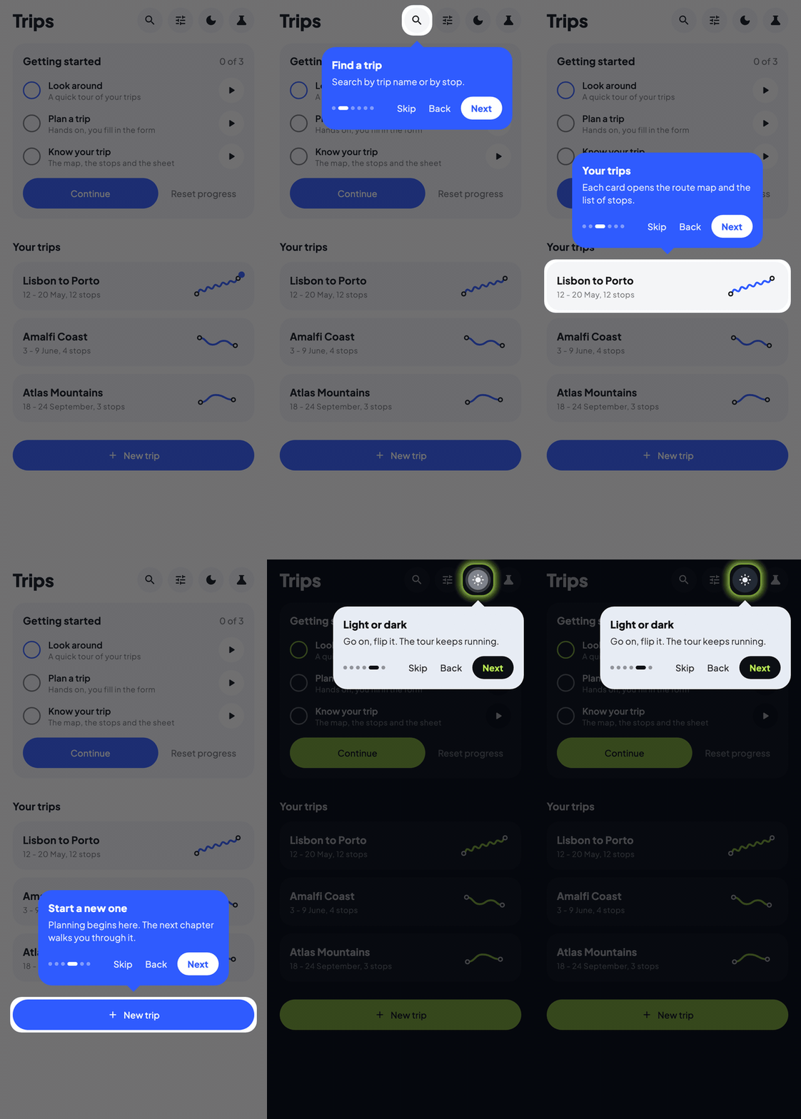
There are three things to do: describe the steps, tag the targets, and wrap the screen in a host.
1. Add the dependency
Add waypoint-material3 (or waypoint-core if you want custom tooltips) to your project. See Installation for details.
// build.gradle.kts
kotlin {
    sourceSets {
        commonMain.dependencies {
            implementation(libs.waypoint.material3)
        }
    }
}
2. Define step keys
Create an enum (or any type) to identify each tour target:
Step keys are generic: you can use an enum, a sealed class, strings, or any type that works as a map key.
3. Create the tour state
Use rememberWaypointState to define the steps in your composable:
val tourState = rememberWaypointState {
    step(OnboardingTarget.SearchBar) {
        title = "Search"
        description = "Find anything in your workspace."
    }
    step(OnboardingTarget.AddButton) {
        title = "Create"
        description = "Add a new item with one tap."
    }
    step(OnboardingTarget.Profile) {
        title = "Your profile"
        description = "View and edit your account settings."
    }
}
Each step block maps a target key to tooltip content. Steps are shown in the order they are declared.
The builder runs once. If the texts come from string resources, pass the locale (or any value the steps depend on) as a key so they are rebuilt when it changes, while a running tour keeps its place:
val locale = Locale.current
val tourState = rememberWaypointState(locale) {
    step(OnboardingTarget.SearchBar) {
        title = stringResource(Res.string.tour_search_title)
    }
}
4. Mark targets with Modifier.waypointTarget()
Attach Modifier.waypointTarget() to the composables you want to highlight:
SearchBar(
    modifier = Modifier.waypointTarget(tourState, OnboardingTarget.SearchBar)
)

FloatingActionButton(
    onClick = { /* ... */ },
    modifier = Modifier.waypointTarget(tourState, OnboardingTarget.AddButton)
) {
    Icon(Icons.Default.Add, contentDescription = "Add")
}

IconButton(
    onClick = { /* ... */ },
    modifier = Modifier.waypointTarget(tourState, OnboardingTarget.Profile)
) {
    Icon(Icons.Default.Person, contentDescription = "Profile")
}
The modifier registers each composable's position and size so the highlight and tooltip can track it.
5. Wrap your screen in WaypointHost
The host composable renders the spotlight overlay and tooltip on top of your content.
Warning
WaypointHost (or WaypointMaterial3Host) must wrap all content that contains tour targets. Place it at the root of your screen so coordinate calculations align correctly.
6. Start the tour
Call state.start() to begin:
Or trigger it from a button:
Complete example
Here is the full code for a screen with a 3-step onboarding tour:
enum class OnboardingTarget { SearchBar, AddButton, Profile }
@Composable
fun HomeScreen() {
val tourState = rememberWaypointState {
step(OnboardingTarget.SearchBar) {
title = "Search"
description = "Find anything in your workspace."
}
step(OnboardingTarget.AddButton) {
title = "Create"
description = "Add a new item with one tap."
}
step(OnboardingTarget.Profile) {
title = "Your profile"
description = "View and edit your account settings."
}
}
LaunchedEffect(Unit) {
    tourState.start()
}
WaypointMaterial3Host(state = tourState) {
Scaffold(
topBar = {
TopAppBar(
title = { Text("Home") },
actions = {
IconButton(
onClick = { /* ... */ },
modifier = Modifier.waypointTarget(
tourState,
OnboardingTarget.Profile,
),
) {
Icon(Icons.Default.Person, "Profile")
}
},
)
},
floatingActionButton = {
FloatingActionButton(
onClick = { /* ... */ },
modifier = Modifier.waypointTarget(
tourState,
OnboardingTarget.AddButton,
),
) {
Icon(Icons.Default.Add, "Add")
}
},
) { padding ->
Column(modifier = Modifier.padding(padding)) {
SearchBar(
modifier = Modifier.waypointTarget(
tourState,
OnboardingTarget.SearchBar,
),
)
// ... rest of your content
}
}
}
}
Going further
A few things the steps above did not use:
val tourState = rememberWaypointState {
    // A step without a target is shown as a centered card.
    step {
        title = "Welcome"
        description = "A quick look around, it takes 20 seconds."
    }
    step(OnboardingTarget.SearchBar) {
        title = "Search"
        description = "Type something to continue."
        // Let the user really use the highlighted element...
        interaction = TargetInteraction.PassThrough
        // ...and move on when they have. `query` is your own state.
        advanceOn { snapshotFlow { query }.first { it.isNotEmpty() } }
    }
}
See Interactive Tutorials for the full pattern.
The 4 key API entry points
| API | Purpose |
|---|---|
rememberWaypointState(keys...) { } | DSL builder that creates a WaypointState with typed step definitions, rebuilt when a key (for example the locale) changes |
Modifier.waypointTarget(state, key) | Marks a composable as a tour target and registers its bounds |
WaypointHost(state) { content() } | Host composable that renders spotlight overlay and tooltip popup |
WaypointState | State holder with navigation: start(), next(), previous(), goToStep(), goTo(key), stop(), pause(), resume() |
Next steps
- Highlight Styles, customize how targets are highlighted
- Custom Tooltips, build your own tooltip UI
- Interactive Tutorials, steps the user completes by doing
- Analytics, track tour engagement
- Persistence, remember completed tours