Navigation Bar
AdaptiveNavigationBar is an adaptive navigation bar that uses UIKit's UITabBar on iOS and Material3's NavigationBar on other platforms (Android, Desktop, Web).
On iOS, the native UITabBar is created using the iosItems, iosSelectedIndex, and iosOnItemSelected parameters. On Material platforms, the content lambda is used to provide full customization of the NavigationBar content (typically NavigationBarItems).
| Material (Android, Desktop, Web) | Cupertino (iOS < 26) | Liquid Glass (iOS 26+) |
|---|---|---|
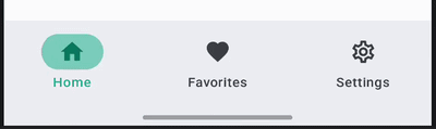 | 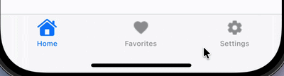 | 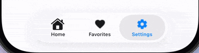 |
Usage
@OptIn(ExperimentalCalfUiApi::class)
@Composable
fun MyNavigationBar() {
    var selectedIndex by remember { mutableIntStateOf(0) }
    val items = listOf("Home", "Search", "Profile")

    AdaptiveNavigationBar(
        // Material content
        content = {
            items.forEachIndexed { index, item ->
                NavigationBarItem(
                    selected = selectedIndex == index,
                    onClick = { selectedIndex = index },
                    icon = { Icon(Icons.Default.Home, contentDescription = item) },
                    label = { Text(item) },
                )
            }
        },
        // iOS-specific parameters
        iosItems = items.map { title ->
            UIKitUITabBarItem(title = title)
        },
        iosSelectedIndex = selectedIndex,
        iosOnItemSelected = { selectedIndex = it },
    )
}
Parameters
| Parameter | Description |
|---|---|
modifier | The modifier to be applied to the navigation bar. |
containerColor | The color used for the background of this navigation bar. |
contentColor | The preferred color for content inside this navigation bar. |
tonalElevation | The tonal elevation of this navigation bar. |
windowInsets | The window insets to be applied to the navigation bar. |
iosItems | The list of tab bar items for the iOS UITabBar. See UIKitUITabBarItem. |
iosSelectedIndex | The index of the currently selected item on iOS. |
iosOnItemSelected | Callback invoked when an item is selected on iOS, with the item index. |
iosConfiguration | Configuration for the iOS UITabBar appearance (item tint colors, translucency). See UIKitTabBarConfiguration. |
content | The content of the navigation bar on Material platforms, typically NavigationBarItems within a RowScope. |
iOS Configuration
You can customize the iOS tab bar appearance using UIKitTabBarConfiguration:
AdaptiveNavigationBar(
    iosItems = items,
    iosSelectedIndex = selectedIndex,
    iosOnItemSelected = { selectedIndex = it },
    iosConfiguration = UIKitTabBarConfiguration(
        selectedItemColor = Color.Red,
        unselectedItemColor = Color.Gray,
        isTranslucent = true,
    ),
    content = { /* Material content */ },
)
| Property | Description |
|---|---|
selectedItemColor | Tint color for selected tab bar items (icon + label). Maps to UITabBar.tintColor. Default: iOS system blue. |
unselectedItemColor | Color for unselected tab bar items (icon + label). Note: Liquid Glass (iOS 26+) ignores this property; not yet supported. |
isTranslucent | Whether the tab bar is translucent. Default: true. |
iOS Tab Bar Items
Use UIKitUITabBarItem to define items for the iOS UITabBar:
UIKitUITabBarItem(
    title = "Home",
    image = UIKitImage.SystemName(SFSymbol.house),
    selectedImage = UIKitImage.SystemName(SFSymbol.houseFill),
)
Tip
Use type-safe SFSymbol constants from calf-ui instead of raw strings. See SF Symbols & Cupertino Icons for details.