Alert Dialog
Calf provides two different alert dialog composables that adapt to the platform they're running on:
- AdaptiveAlertDialog: A simpler API with predefined confirm and dismiss buttons
- AdaptiveBasicAlertDialog: A more flexible API that allows fully custom content on Material platforms and advanced configuration on iOS
Both composables use native UIAlertController on iOS and Material dialogs on other platforms (Android, Desktop, Web).
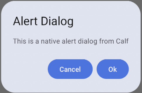
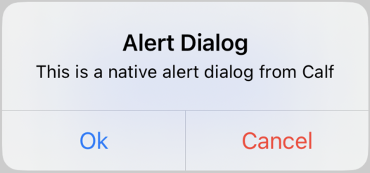
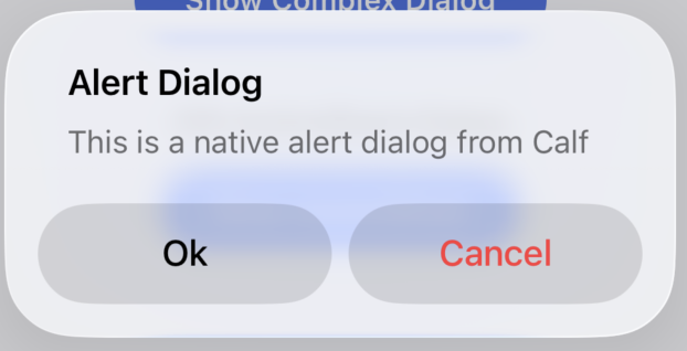
| Material (Android, Desktop, Web) | Cupertino (iOS < 26) | Liquid Glass (iOS 26+) |
|---|---|---|
 |  |  |
AdaptiveAlertDialog
The AdaptiveAlertDialog composable provides a simple API with predefined confirm and dismiss buttons. It's ideal for common dialog scenarios where you just need to show a message with one or two action buttons.
// State to control dialog visibility
var showDialog by remember { mutableStateOf(false) }

// Button to trigger the dialog
Button(
    onClick = { showDialog = true },
) {
    Text("Show Alert Dialog")
}

// Show the dialog when state is true
if (showDialog) {
    AdaptiveAlertDialog(
        onConfirm = {
            // Handle confirmation
            showDialog = false
        },
        onDismiss = {
            // Handle dismissal
            showDialog = false
        },
        confirmText = "OK",
        dismissText = "Cancel",
        title = "Alert Dialog",
        text = "This is a native alert dialog from Calf",
        // Optional: Customize iOS dialog style
        iosDialogStyle = AlertDialogIosStyle.Alert, // or ActionSheet
        iosConfirmButtonStyle = AlertDialogIosActionStyle.Default,
        iosDismissButtonStyle = AlertDialogIosActionStyle.Destructive,
    )
}
Single-button dialog
dismissText is optional. Leave it out, pass null, or pass a blank string to show only the confirm button. On iOS this presents a single UIAlertAction; on Material platforms the AlertDialog is rendered without a dismiss button.
if (showInfoDialog) {
    AdaptiveAlertDialog(
        onConfirm = { showInfoDialog = false },
        onDismiss = { showInfoDialog = false },
        confirmText = "OK",
        title = "Saved",
        text = "Your changes have been saved.",
    )
}
onDismiss is still invoked when the user taps outside the dialog or presses back, so it stays required. On iOS the set of buttons is fixed when the dialog is first presented: toggling dismissText between null and a value while the dialog is visible takes effect the next time it is shown.
AdaptiveBasicAlertDialog
The AdaptiveBasicAlertDialog composable provides a more flexible API that allows fully custom content on Material platforms and advanced configuration on iOS through the iosProperties parameter. It's marked with @ExperimentalCalfUiApi annotation.
// State to control dialog visibility
var showComplexDialog by remember { mutableStateOf(false) }

// Configure iOS-specific properties
val iosProperties = rememberAlertDialogIosProperties(
    title = "Custom Dialog",
    text = "This dialog has custom content",
    style = AlertDialogIosStyle.Alert,
    actions = listOf(
        AlertDialogIosAction(
            title = "OK",
            style = AlertDialogIosActionStyle.Default,
            onClick = { showComplexDialog = false }
        ),
        AlertDialogIosAction(
            title = "Cancel",
            style = AlertDialogIosActionStyle.Cancel,
            onClick = { showComplexDialog = false }
        )
    )
)

// Show the dialog when state is true
if (showComplexDialog) {
    AdaptiveBasicAlertDialog(
        onDismissRequest = { showComplexDialog = false },
        iosProperties = iosProperties,
        materialContent = {
            // Custom content for Material platforms
            Surface(
                shape = RoundedCornerShape(28.dp),
                color = MaterialTheme.colorScheme.surface,
                tonalElevation = 6.dp
            ) {
                Column(
                    modifier = Modifier.padding(24.dp),
                    horizontalAlignment = Alignment.CenterHorizontally
                ) {
                    Text(
                        "Custom Dialog",
                        style = MaterialTheme.typography.headlineSmall
                    )
                    Spacer(modifier = Modifier.height(16.dp))
                    Text("This dialog has fully custom content on Material platforms")
                    Spacer(modifier = Modifier.height(24.dp))
                    Row(
                        modifier = Modifier.fillMaxWidth(),
                        horizontalArrangement = Arrangement.End
                    ) {
                        TextButton(onClick = { showComplexDialog = false }) {
                            Text("Cancel")
                        }
                        Button(onClick = { showComplexDialog = false }) {
                            Text("OK")
                        }
                    }
                }
            }
        }
    )
}
iOS Action Sheet Style
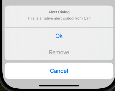
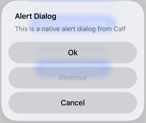
On iOS, you can display the dialog as an action sheet that slides up from the bottom of the screen:
// State to control dialog visibility
var showActionSheetDialog by remember { mutableStateOf(false) }

// Configure iOS-specific properties
val actionSheetProperties = rememberAlertDialogIosProperties(
    title = "Choose an Option",
    text = "Select one of the following actions",
    style = AlertDialogIosStyle.ActionSheet,
    actions = listOf(
        AlertDialogIosAction(
            title = "Confirm",
            style = AlertDialogIosActionStyle.Default,
            onClick = { showActionSheetDialog = false }
        ),
        AlertDialogIosAction(
            title = "Cancel",
            style = AlertDialogIosActionStyle.Cancel,
            onClick = { showActionSheetDialog = false }
        ),
        AlertDialogIosAction(
            title = "Delete",
            style = AlertDialogIosActionStyle.Destructive,
            onClick = { showActionSheetDialog = false }
        ),
    )
)

// Show the action sheet dialog
if (showActionSheetDialog) {
    AdaptiveBasicAlertDialog(
        onDismissRequest = { showActionSheetDialog = false },
        iosProperties = actionSheetProperties,
        materialContent = {
            // Your custom Material UI content here
            // This example focuses on iOS action sheet functionality
        }
    )
}
| iOS Action Sheet (Cupertino, iOS < 26) | iOS Action Sheet (Liquid Glass, iOS 26+) |
|---|---|
 |  |
Dialog with Text Fields (iOS)
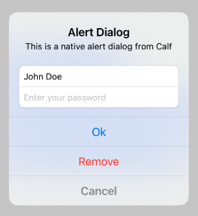
On iOS, you can add text fields to your alert dialog for user input:
// State to control dialog visibility
var showComplexDialog by remember { mutableStateOf(false) }

// Configure iOS-specific properties with text fields
val complexProperties = rememberAlertDialogIosProperties(
    title = "Login",
    text = "Please enter your credentials",
    style = AlertDialogIosStyle.Alert,
    severity = AlertDialogIosSeverity.Critical,
    actions = listOf(
        AlertDialogIosAction(
            title = "Login",
            style = AlertDialogIosActionStyle.Default,
            onClick = { showComplexDialog = false }
        ),
        AlertDialogIosAction(
            title = "Cancel",
            style = AlertDialogIosActionStyle.Cancel,
            onClick = { showComplexDialog = false }
        )
    ),
    textFields = listOf(
        AlertDialogIosTextField(
            placeholder = "Email",
            initialValue = "",
            keyboardType = IosKeyboardType.EmailAddress,
            isSecure = false,
            onValueChange = { email ->
                println("Email: $email")
            }
        ),
        AlertDialogIosTextField(
            placeholder = "Password",
            initialValue = "",
            isSecure = true,
            onValueChange = { password ->
                println("Password: $password")
            }
        )
    )
)

// Show the dialog with text fields
if (showComplexDialog) {
    AdaptiveBasicAlertDialog(
        onDismissRequest = { showComplexDialog = false },
        iosProperties = complexProperties,
        materialContent = {
            // Your custom Material UI content here
            // This example focuses on iOS text field functionality
        }
    )
}
| iOS Dialog with Text Fields |
|---|
 |
Customizing Action Styles (iOS)
You can customize the appearance and behavior of actions in your dialog:
// Configure actions with different styles
val actions = listOf(
    AlertDialogIosAction(
        title = "OK",
        style = AlertDialogIosActionStyle.Default,  // Standard button
        onClick = { /* handle OK */ }
    ),
    AlertDialogIosAction(
        title = "Cancel",
        style = AlertDialogIosActionStyle.Cancel,   // Emphasized cancel button
        onClick = { /* handle cancel */ }
    ),
    AlertDialogIosAction(
        title = "Delete",
        style = AlertDialogIosActionStyle.Destructive,  // Red destructive button
        enabled = true,  // Can be disabled with false
        onClick = { /* handle delete */ }
    )
)